What is a Vendor Management System (VMS)? 2026 Guide
- October 03
- 11 min


A user-friendly Vendor Management System (VMS) is a software platform designed to streamline supply chain processes with intuitive navigation, customizable dashboards, and workflows. It prioritizes user-centric design, reducing complexity and cognitive load to enhance productivity and collaboration. By tailoring features to specific roles and automating repetitive tasks, it ensures efficient, error-free operations for both businesses and suppliers.
Vendor Management Systems (VMS) are the digital backbone of modern supply chains. They streamline processes from procurement to payment. Yet, many organizations struggle to realize their full potential. The reason is often simple: the software is too complex. When users are overwhelmed by clunky interfaces and convoluted processes, adoption stalls, data accuracy suffers, and the promised efficiency gains never materialize. The key to unlocking the true value of a VMS lies in a user-centric approach. By prioritizing intuitive UX, customizable dashboards, and workflows, businesses can transform their VMS from a cumbersome chore into a powerful engine for productivity and supplier collaboration. Well-designed features of vendor management platforms improve user adoption.
This article explores the best practices for designing a user-friendly vendor management system that people will actually want to use. We will cover all aspects from foundational UX principles and information architecture to workflow automation and accessibility, providing a comprehensive blueprint for building a VMS that drives real business results.
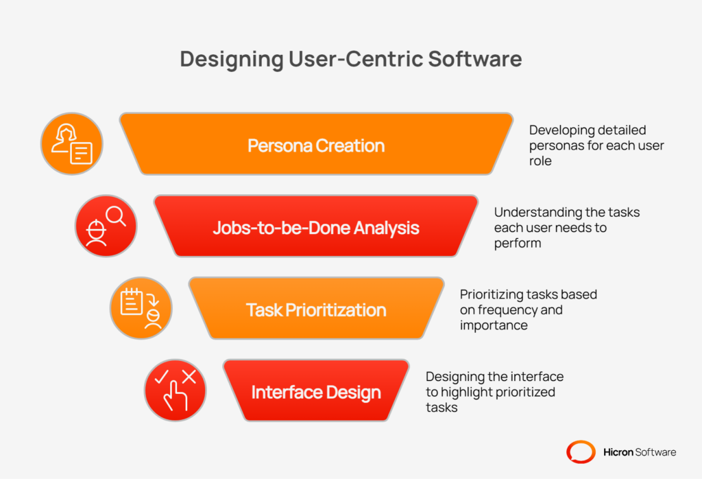
The most common mistake in VMS design is building a system around a list of features rather than the people who will use it. A truly user-friendly vendor management system begins with a deep understanding of its audience. This requires moving beyond generic “user” labels and developing detailed personas for each key role interacting with the system. A buyer has different needs than a quality manager, whose daily tasks are distinct from those of a supplier or a finance professional.
By adopting a persona-driven design approach, you can map out the specific “jobs-to-be-done” for each user group. What tasks do they perform most frequently? What information is most critical to their success? Understanding task frequency and importance helps inform the layout of interfaces, ensuring that common actions are easily accessible and shortcuts are available for repetitive tasks.
The ultimate goal is to reduce cognitive load. A well-designed system presents information in a clear hierarchy, uses progressive disclosure to reveal complexity only when needed, and leverages familiar design patterns that users already understand. This makes the system feel intuitive and less intimidating, encouraging exploration and adoption.
Once you understand your users, the next step is to organize the system in a way that makes sense to them. A confusing navigation structure is a primary source of user frustration. People should be able to find what they need and take action without having to hunt through confusing menus or guess where to click next.
|
Aspect of Navigation |
Description |
Key Benefits |
|
Logical Menu Structure |
Group functions by user tasks (e.g., Orders, Audits, Documents) rather than by departmental org charts. |
Mirrors how users think about their work, simplifies the user journey, and allows users to complete goals with fewer clicks. |
|
Search and Filters |
Implement a powerful, global search function with robust filtering, saved filters, and access to recent activity. |
Enables users to find information quickly, narrow down results efficiently, and streamline repetitive searches, saving valuable time. |
|
Contextual Breadcrumbs and Actions |
Use breadcrumbs to show users their location in the system and embed next-best action buttons directly within workflows. |
Keeps users oriented, provides easy navigation, and guides them to the next logical step, making the interface more efficient. |
Effective information architecture groups functions by tasks, not by organizational charts. Instead of menus like “Procurement Dept” or “Finance Dept,” structure your navigation around user goals like “Orders,” “Quality,” “Audits,” and “Documents.” This task-oriented approach is more intuitive because it mirrors how people think about their work. It simplifies the user journey, allowing them to complete their objectives with fewer clicks.
No matter how logical the navigation, users will often turn to search as their primary way of finding information. A powerful, global search function that can query across different modules is essential. Enhance this with robust filtering capabilities that allow users to narrow down results based on specific criteria. The ability to save frequently used filter combinations and access a list of recent activity further streamlines the process, saving valuable time.
Breadcrumbs are a simple but powerful tool for user orientation. They show users where they are within the system’s hierarchy and provide an easy way to navigate back. To make the interface even more efficient, embed contextual, next-best action buttons directly within the workflow. For example, on a purchase order screen, an “Acknowledge Order” or “Create Shipment” button should be immediately visible and accessible, guiding the user to the next logical step.
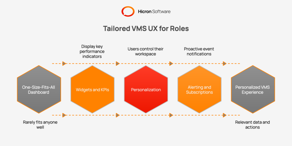
A one-size-fits-all dashboard rarely fits anyone well. Different roles require different information to perform their jobs effectively. Customizable dashboards are a core component of VMS UX best practices, empowering users to create a personalized view that surfaces the data and actions most relevant to them.
Dashboards should be built from a library of configurable widgets, each displaying a key performance indicator (KPI) or a critical data point. A procurement manager might want to see on-time delivery (OTD) rates and pending order confirmations. A quality manager, on the other hand, would prioritize widgets showing the number of aging non-conformance reports (NCRs) or expiring supplier certificates. These at-a-glance metrics provide an instant health check and direct users’ attention to areas that need it most.
Go beyond role-based templates by giving users control over their own workspace. A drag-and-drop interface that allows individuals to arrange widgets according to their preference is a powerful feature. The ability to save different dashboard views for different contexts (e.g., “End of Month” vs. “Daily Tasks”) adds another layer of utility. Simple personalization options like light/dark mode and data density controls (compact vs. comfortable view) also improve user comfort and reduce eye strain during long hours.
A great dashboard doesn’t just display information; it actively brings important events to the user’s attention. Implement a system for threshold-based alerts that can trigger in-app notifications or send emails when a KPI crosses a certain point. Allow users to subscribe to digest emails that summarize key activities, reducing the need to constantly check the system. This proactive approach turns the VMS into an active partner in managing the supply chain.
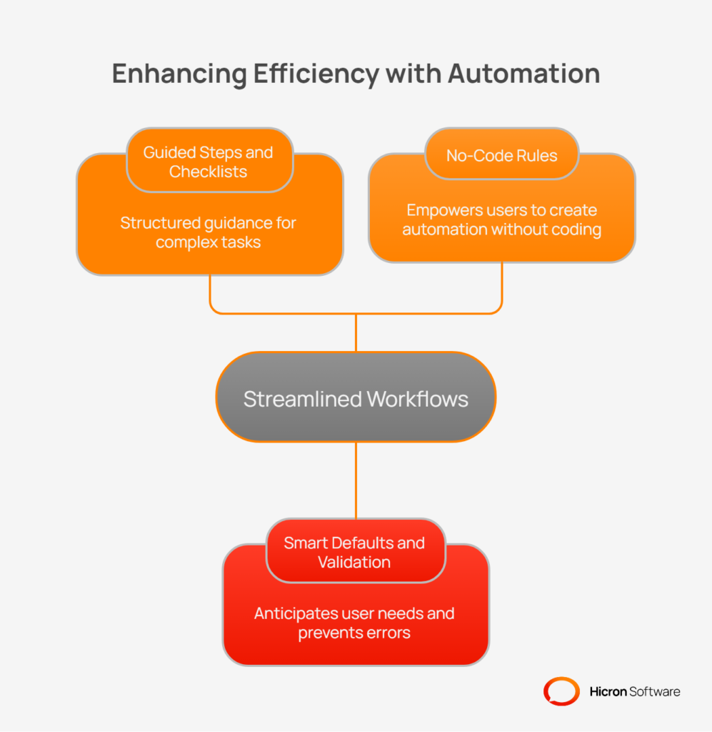
The most effective VMS workflows are those that feel natural and intuitive because they are modeled after real-world processes. Instead of forcing users to adapt to the software’s logic, the software should adapt to the user’s way of working. This is a cornerstone of effective workflow automation.
For complex, multi-step processes, use guided wizards and checklists to walk users through the required actions. This is invaluable for tasks like new supplier onboarding, where multiple documents and approvals are needed. It’s also effective for managing a complaint that needs to escalate into a Corrective Action/Preventive Action (CAPA) plan, or for moving an audit from the planning stage to final closure. These guided flows reduce errors and ensure process compliance.
Reduce the burden of data entry by making the system smarter. Pre-fill fields with logical defaults based on previous steps or known information. Use inline validation to provide immediate feedback on data entry errors, rather than waiting for the user to submit a form. Design actions to be idempotent where possible, meaning that performing the same action multiple times has the same effect as performing it once, which prevents accidental duplicates. Finally, a universal “undo” function can be a lifesaver, giving users the confidence to act without fear of making irreversible mistakes.
Empower business users to configure their own processes without needing a developer. A no-code rules engine allows administrators to set up SLA timers, automate escalations for overdue tasks, and define routing logic for approvals. This agility allows the business to adapt the VMS to changing needs quickly, without getting stuck in long IT development cycles.
Your suppliers are critical users of the VMS, but their experience is often an afterthought. A confusing or cumbersome supplier portal creates friction, delays, and poor data quality. A positive supplier portal UX is essential for effective collaboration.
The portal should provide clean, easy-to-understand views of purchase orders, simple mechanisms for acknowledgements, and a straightforward process for submitting advance ship notices (ASNs). Document uploads should be simple and intuitive.
Key elements of the portal must be mobile-responsive, allowing suppliers to manage essential tasks from a phone or tablet. Pay attention to localization by providing support for different languages, date formats, and number formats to accommodate a global supply base. Clear status indicators, helpful tooltips, and transparent expectations for turnaround times will dramatically improve the supplier experience.
| Feature area | Key elements | Impact on supplier experience |
| Core tasks | Clean PO views, easy acknowledgements, simple ASN submission, and document uploads. | Reduces time spent on administrative work and minimizes data entry errors. |
| Accessibility | Mobile-responsive design for essential actions and clear status indicators. | Allows suppliers to respond quickly from any device and always know the status of their tasks. |
| Localization | Support for multiple languages, regional date formats, and number formats. | Prevents confusion and misinterpretation of critical information, such as due dates and quantities. |
| Guidance | Contextual help cues, tooltips, and clear expectations for turnaround times. | Empowers suppliers to self-serve and reduces the need to contact your team for support. |
Every manual keystroke is an opportunity for an error. A user-friendly vendor management system should actively work to minimize manual data entry and streamline how information is handled.
Enable inline editing in tables and lists, allowing users to make quick changes without navigating to a separate edit screen. Provide bulk actions that let users update multiple records at once. For large data sets, offer robust CSV or API import tools that include a preview step and provide clear, actionable error hints if the data is formatted incorrectly.
When it comes to file handling, support drag-and-drop uploads directly into the browser. Implement a file allowlist to ensure only approved file types are uploaded, and automatically scan all files for viruses. The system can also capture metadata from files to reduce manual tagging. Finally, provide templates for recurring tasks, such as quality checklists or audit forms, to save time and ensure consistency.
Accessibility is not a niche feature; it is a fundamental component of good design. Building an inclusive VMS ensures that all users, regardless of ability, can interact with the system effectively. This commitment to accessibility in VMS design also benefits all users by creating a more robust and usable interface.
Adhere to Web Content Accessibility Guidelines (WCAG) 2.1 AA standards. This includes ensuring sufficient color contrast, making all functionality navigable via a keyboard, and using ARIA labels to provide context for screen readers. Form labels, error messages, and focus states should be designed for maximum clarity.
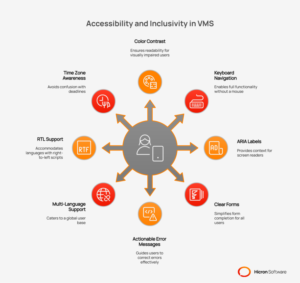
For global operations, localization is key. The system must support multiple languages, including right-to-left languages, and correctly handle different time zones. This includes:
Performance is a feature. A slow, laggy interface is a major barrier to adoption. Users have come to expect instant feedback from the software they use, and a VMS is no exception.
Invest in engineering to ensure snappy list loading, using techniques like pagination and intelligent caching to manage large data sets.
Use optimistic UI updates for common actions; for example, when a user archives an item, the UI can update immediately while the server request completes in the background. This makes the application feel faster and more responsive.
For long-running tasks like large file uploads or report generation, use offline-tolerant patterns that allow the user to continue working while the task processes in the background.
Security shouldn’t come at the cost of usability. A security-aware UX integrates security measures seamlessly into the user’s workflow, protecting sensitive data without creating unnecessary roadblocks.
Use role-based access control (RBAC) to restrict actions and hide irrelevant modules and fields. This simplifies the interface for users and reduces the risk of them accessing or modifying data they shouldn’t. For sensitive actions, use just-in-time access prompts to verify identity or intent. Provide clear, non-intrusive warnings about session timeouts. If an action is blocked due to permissions or policy, provide a clear, plain-language explanation so the user understands why and who to contact if they need access.
Even the most intuitive system requires some level of onboarding and support. The goal is to guide users to the “aha!” moment, the point where they understand the value the VMS provides, as quickly as possible.
Use in-app tours and tooltips to introduce new users to key features in context. Create a contextual help center that suggests relevant articles based on the user’s current screen. Develop role-based quick-start guides, video snippets, and provide a sandbox environment with sample data where users can practice without fear of breaking anything. It’s also critical to establish feedback loops, such as in-product Net Promoter Score (NPS) surveys and a feature request portal, to continuously gather user input.
A VMS contains a wealth of data, but data is useless without insight. The system should help users move beyond simply viewing information to understanding what it means and how to act on it.
Design analytics features that allow users to drill down from a high-level KPI on a dashboard directly to the underlying records. This enables them to investigate anomalies and take immediate action. Use effective data visualizations like Pareto charts, heatmaps, and trend lines to make complex data easier to understand. All visualizations and reports should be easily exportable to business intelligence (BI) tools for further analysis. Advanced features like anomaly detection flags and “what changed” diffs on critical records can help users spot important changes that might otherwise go unnoticed.
Designing a user-friendly VMS is not a one-time project. It’s an ongoing process of improvement. The final key to success is to create a tight loop of testing, learning, and iteration.
Conduct regular usability testing with real users to observe how they interact with the system. Use A/B tests to compare different design solutions for high-traffic workflows. Track key UX metrics like task success rate, time-on-task, error rate, and feature adoption to quantitatively measure the impact of your design changes. Maintain a “UX debt” log to track known issues and prioritize them for future releases. Finally, use your release notes to communicate improvements to users, highlighting how their feedback has led to a better product.
| Improvement process | Description | Key components |
| User testing | Gathers direct feedback by observing real users interacting with the system. | Usability testing sessions, A/B tests for high-traffic workflows, and prototype validation. |
| UX metrics | Provides quantitative data to measure the effectiveness and efficiency of the interface. | Task success rate, time-on-task, error rate, and feature adoption rates. |
| Continuous refinement | Establishes a transparent system for tracking and communicating improvements over time. | Maintaining a UX debt log and publishing user-focused release notes that highlight benefits. |
Transforming a VMS into a user-friendly system can seem like a daunting task. A phased approach makes the process manageable and delivers value incrementally.
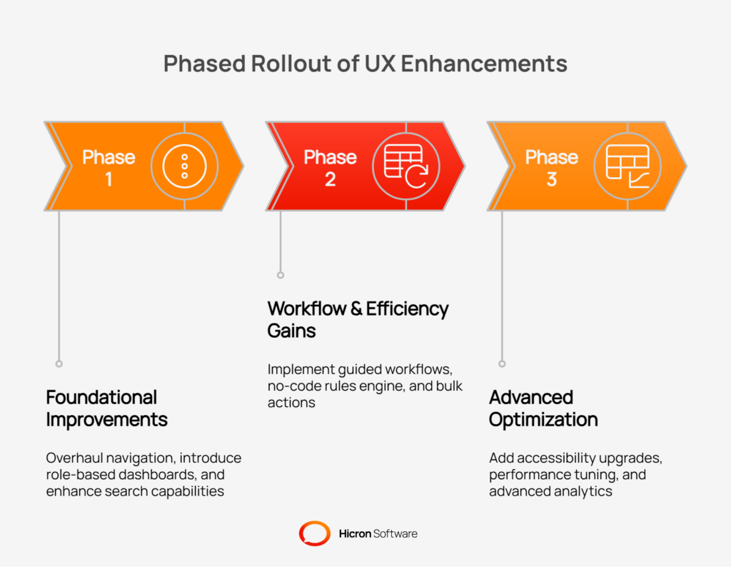
A VMS is only as good as the data within it, and data quality is directly tied to user adoption. By shifting the focus from features to users, you can create a system that actively supports productivity rather than hindering it. A combination of role-tailored dashboards, intuitive navigation, and automated workflows forms the foundation of a VMS that empowers users, strengthens supplier relationships, and drives measurable business value.
To begin this journey, start by running a UX baseline study to identify the biggest pain points in your current system. Prioritize the top three workflows by business impact and user frustration, and launch a 90-day sprint focused on improving them. By taking this iterative, user-centric approach, you can build a vendor management system that your teams and suppliers will not just tolerate, but love to use.
Need assistance with designing a user-friendly Vendor Management System? Contact us today, and let our experts help you create intuitive, efficient, and impactful solutions tailored to your needs!
A user-friendly vendor management system prioritizes intuitive navigation, role-specific dashboards, and automated workflows to simplify complex tasks and boost productivity.
Customizable dashboards enable users to focus on relevant metrics and tasks, improving efficiency and reducing clutter for roles such as buyers, suppliers, and quality managers.
Accessibility ensures that everyone, regardless of physical abilities or location, can use the system effectively, meeting WCAG 2.1 AA standards and supporting global inclusivity.
Workflow automation reduces manual tasks, minimizes errors, and streamlines processes like approvals, escalations, and compliance tracking, saving time and resources.
Advanced analytics with drill-down capabilities, visualizations, and anomaly detection help users turn data into actionable insights, driving better decisions and operational efficiency.
Hicron Software proved to be a trusted partner with unmatched technical expertise, delivering a scalable and user-friendly web application that was pivotal to our successful U.S. market expansion.

Hicron’s contributions have been vital in making our product ready for commercialization. Their commitment to excellence, innovative solutions, and flexible approach were key factors in our successful collaboration.
I wholeheartedly recommend Hicron to any organization seeking a strategic long-term partnership, reliable and skilled partner for their technological needs.

After carefully evaluating suppliers, we decided to try a new approach and start working with a near-shore software house. Cooperation with Hicron Software House was something different, and it turned out to be a great success that brought added value to our company.
With HICRON’s creative ideas and fresh perspective, we reached a new level of our core platform and achieved our business goals.
Many thanks for what you did so far; we are looking forward to more in future!
Hicron is a partner who has provided excellent software development services. Their talented software engineers have a strong focus on collaboration and quality. They have helped us in achieving our goals across our cloud platforms at a good pace, without compromising on the quality of our services. Our partnership is professional and solution-focused!

The IT system supporting the work of retail outlets is the foundation of our business. The ability to optimize and adapt it to the needs of all entities in the PSA Group is of strategic importance and we consider it a step into the future. This project is a huge challenge: not only for us in terms of organization, but also for our partners – including Hicron – in terms of adapting the system to the needs and business models of PSA. Cooperation with Hicron consultants, taking into account their competences in the field of programming and processes specific to the automotive sector, gave us many reasons to be satisfied.
