June 30
28 min


Insurance UI design focuses on creating user-friendly interfaces for digital insurance platforms. It simplifies complex processes, builds trust, and ensures customers can navigate with ease. A well-designed insurance interface enhances customer satisfaction, improves retention, and aligns with business goals.
By improving user interface in insurance platforms, companies can streamline operations, boost conversions, and meet the needs of both policyholders and internal teams. In an industry where trust is critical, an intuitive and reliable insurance interface is key to success.
This guide covers the essentials of insurance UI design, answers the question of how to streamline insurance user interface, and offers actionable strategies to optimize navigation, refine visuals, and simplify workflows. Whether modernizing insurance legacy systems or enhancing mobile capabilities, these tips will help make insurance platforms more accessible, trustworthy, and effective.
From bridging the gap between intricate policy details and user-friendly design to creating mobile interfaces, this guide stresses insurance UI design best practices that will help you craft an insurance user interface that engages and retains customers while boosting conversions.
The insurance industry presents unique challenges in crafting the best practices insurance UI. Insurance web applications and insurance platforms must balance regulatory compliance, user-friendly design, and financial product complexity to deliver a satisfying experience for users.
|
Challenge |
Solution |
Example |
|
Complex and overwhelming terminology |
Translate technical terms and legal jargon into plain language |
Deductible → “The amount you pay out-of-pocket before your coverage begins” Exclusions → “Events or items that the policy does not cover” |
|
Provide tooltips, glossaries, or hover-over definitions |
Hover over “Deductible” to reveal an explanation like “This is the portion you pay before your insurance covers the rest.” |
|
|
Intricate policy details |
Break down policy components into relatable examples |
Liability coverage explained as, “This protects you if you cause damage to someone else’s car or property in an accident.” |
|
Define each element in terms of customer impact |
“Premium covers $XXX annual claim limit.” |
|
|
Cognitive overload from too much info upfront |
Use progressive disclosure to present details in steps |
Policy Comparison Pages: Show high-level distinctions (monthly premium, deductible), with an option to expand for further details. Step-By-Step Forms for Quotes: Begin with basic inputs (ZIP code and coverage needs) and layer in additional fields (vehicle or health history). Expandable Sections: Summarize critical coverage details upfront, with optional dropdowns for details like exclusions or add-ons. |
|
Navigating dense information |
Utilize visual hierarchies |
Use bold headlines, color coding, and icons to highlight key details like “Total Monthly Premium” and “Coverage Start Date.” |
|
Highlight critical information at the top of pages |
List key coverage details right at the start, with less relevant details placed lower. |
|
|
Limited decision-making tools |
Incorporate interactive features for better understanding |
Provide sliders for adjusting deductibles that dynamically update premium amounts in real time. |
|
Overwhelmed users |
Present brief summaries and provide access to more information |
“Your insurance covers liability and collision for $40/month.” Include a “Read More” link for specifics about liability coverage. |
|
Use visually engaging aids like infographics or timelines |
A timeline showing how deductibles work across the claims process, from filing the claim to when coverage begins. |
|
|
Compliance and transparency demands |
Ensure simplified information aligns with legal accuracy |
Include disclaimers like “Subject to state-specific regulations” alongside clear language. |
|
Highlight mandatory legal information without overwhelming users |
Use collapsible sections labeled “Required Legal Information” for transparency while maintaining simplicity. |
|
|
Offer access to full policy details for users who require them |
Make detailed documents, such as a full policy PDF, downloadable for thorough review. |
Compliance introduces extra layers of complexity. Each region has its unique set of regulations, like HIPAA for health insurance or other state-specific rules. Integrating these seamlessly into an insurance user experience ensures mandatory disclosures don’t disrupt the user flow but enhance transparency.
Trust is at the forefront of insurance UI design. Customers share sensitive personal data, so reinforcing trust through secure, professional layouts with visible trust signals (like SSL certifications and security badges) is essential to build credibility.
|
Trust-Building Strategy |
Implementation |
Example |
|
Secure and Professional Layouts |
Design clean, modern interfaces with intuitive navigation and logical flows. |
Use consistent branding across digital touchpoints to foster cohesion (e.g., matching website and mobile app designs). |
|
Visible Trust Signals |
Display SSL certificates, security badges, and data privacy messages prominently. |
Show a padlock icon next to the URL or include “Your data is encrypted and secure” messages on sensitive forms like payments. |
|
Transparency in Communication |
Clearly explain why data is collected and how it’s used. |
“We need your income details to provide accurate premium calculations” shown near financial data input fields. |
|
Reinforcing Credibility |
Highlight certifications, regulatory affiliations, and awards. |
Display ISO certifications or industry memberships on pages involving policy enrollment or claims submission. |
|
User Assistance and Support |
Make support options highly visible and accessible. Offer guided workflows and tooltips. |
Provide in-app customer assistance options like live chat or a toll-free number placed prominently on the home page. |
|
Error Handling and Forgiveness |
Write helpful error messages with specific guidance. |
Use “It seems the ZIP code is incorrect. Please try again” instead of “Invalid input.” |
|
Claims Process Transparency |
Offer step-by-step visual timelines and updates for claims progress. |
Status updates like “Photos submitted” → “Adjuster assigned” → “Claim under review” displayed in a dynamic progress bar. |
|
Credentials and Validation |
Showcase trust via visible badges and third-party endorsements. |
Include Better Business Bureau affiliation or similar credentials on landing pages. |
|
Two-Factor Authentication (2FA) |
Require 2FA for sensitive actions such as accessing policy details or signing documents. |
Enable users to verify actions using a code sent to their email or mobile device. |
|
Color Psychology |
Use trusted colors like blues and greens that evoke calm and reliability. |
Incorporate soft blue tones in header sections or around key action buttons like “Submit Claim” or “Purchase Policy.” |
|
Minimalistic Design |
Avoid excessive clutter and focus on critical elements. |
Limit unnecessary graphics and stick to clean, minimal layouts with plenty of white space. |
|
High-Quality Imagery |
Use authentic visuals rather than generic stock photos to humanize digital interactions. |
Real photos of agents, local offices, or satisfied customers filing claims or purchasing policies. |
Mobile design has become a pivotal element in insurance user experiences, as more customers rely on smartphones to research policies, manage accounts, and file claims. A mobile-first approach is critical to meeting user expectations. Optimizing insurance interfaces for smaller screens can make the difference between retaining a customer and losing them to frustration.
Mobile-first design ensures accessibility and convenience, allowing users to interact with insurance platforms wherever they are. This is especially important in emergencies when customers might need to file a claim or check policy details on the go.
A mobile-friendly interface also aligns with the growing preference for quick, self-service capabilities, giving users the tools to solve problems independently without contacting customer support. Beyond convenience, it’s a strategic imperative. Poor mobile experiences can lead to higher abandonment rates and, ultimately, lost revenue and damaged customer trust.
Prioritizing mobile-first design in insurance UI ensures that the experience is intuitive, accessible, and responsive to the needs of today’s mobile-dependent customers. Companies that optimize insurance interfaces for mobile will not only satisfy evolving user expectations but will also establish themselves as forward-thinking, customer-centric market leaders.
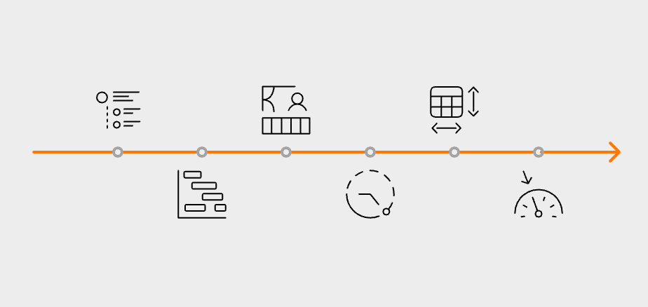
To sum up, common customer frustrations in insurance UI include:
Creating exceptional insurance UI design starts with applying foundational principles tailored to the industry’s needs.
Use progressive disclosure techniques to present information in manageable steps.
Example: Show high-level coverage details like premium costs and deductibles first, and allow users to expand sections for more detailed information (e.g., exclusions or optional add-ons).
Benefits:
Highlight the most important content to help users quickly locate essential details.
Example Techniques:
Leverage color contrast, whitespace, and intuitive grouping of related data.
Example: Pair coverage information with respective benefits for clarity.
Ensure a unified look and feel across all platforms (desktop, mobile, and app).
Benefits:
Adhere to WCAG (Web Content Accessibility Guidelines) to cater to all users, including those with disabilities.
Examples of Accessibility Features:
Benefit:
Integrate visible trust elements to enhance credibility.
Examples:
|
Design Principle |
Implementation |
Example |
|
Simplify Complex Information |
Use progressive disclosure to present information in manageable steps. |
Start with key details like premium costs and allow users to expand sections for exclusions or optional add-ons. |
|
Establish Clear Visual Hierarchy |
Highlight important details using larger fonts, bold text, and intuitive groupings. |
Display “Total Premium” prominently and use secondary placement for optional riders or extra details. |
|
Maintain Consistent Design Patterns |
Use uniform navigation menus, button styles, and form layouts across all platforms. |
Keep website navigation menus identical to those on mobile apps to facilitate familiarity and ease of use. |
|
Ensure Accessibility Compliance |
Adhere to WCAG guidelines with features like high-contrast schemes, keyboard navigability, and alt text. |
Provide screen reader compatibility and captions for video content to accommodate users with disabilities. |
|
Incorporate Trust Signals |
Include visible indicators of security and reassurance, such as trust badges and secure microcopy. |
Place “Your information is securely encrypted” text near payment forms and display SSL certification badges. |
By applying these principles, insurance companies can design interfaces that are:
Streamlining the quote and application process in insurance platforms is integral to reducing user drop-offs and enhancing satisfaction. An effective way to simplify this process is by breaking it down into comprehensible multi-step forms.
Instead of presenting all fields at once, dividing the form into logical sections, such as
ensures users can focus on one aspect at a time. Coupled with real-time validation, this approach minimizes frustration by immediately alerting users to errors, such as an incorrectly entered ZIP code or invalid phone number, and provides guidance to correct them. These measures enhance the overall ease of use, preventing users from encountering setbacks during submission.
Using progress indicators is another critical factor in optimizing the experience. Clearly defined visual elements, such as a step-by-step progress bar at the top of the form, keep users informed about how much they’ve completed and how many steps remain.
Pairing this with save functionality allows users to leave and return to their forms without losing data, accommodating those who may need more time to gather required information. Incorporating smart defaults and auto-filled fields can greatly simplify the process. For example, pre-populating city and state fields based on the ZIP code entered reduces the amount of input required and makes the form feel less tedious.
For mobile users, optimizing the application process takes on added importance. Reduced screen real estate requires careful attention to layout and usability. Techniques like
maintain clarity and make navigation possible on smaller devices.
Accessible entry methods, such as drop-down menus for selecting policy options or leveraging device autofill for frequent information like contact details, improve both speed and accuracy. Ensuring mobile responsiveness and quick page loading times instills confidence, especially when users are on the go.
|
Feature |
Implementation |
Example |
|
Simplify Forms Into Steps |
Break forms into smaller, logical sections with descriptive titles for clarity. |
Replace “Step 1 of 5” with specific labels like “Personal Information” or “Coverage Preferences.” |
|
Real-Time Validation |
Notify users instantly when incorrect information is entered to prevent cascading errors. |
Flag invalid social security numbers or highlight misspellings as users type. |
|
Progress Indicators and Save Options |
Display progress visually and allow users to save their progress for later completion. |
Use progress messages like “You’re 75% complete!” with the option to continue later without losing entered data. |
|
Default and Auto-Populate Fields |
Pre-fill fields using known data (e.g., city/state from ZIP codes) while keeping fields editable. |
Automatically enter the city and state after a ZIP code is entered, but allow users to modify if needed. |
|
Mobile Optimizations |
Use mobile-friendly features like thumb-friendly button placements and simple layouts. |
Implement one-column layouts, dropdown menus, and large buttons for better navigation on mobile devices. |
By integrating these features into the quote and application process, insurance companies can create a streamlined, user-friendly experience. These efforts not only help improve form completion rates but also foster a sense of satisfaction and trust, ultimately encouraging users to move forward with their insurance decisions.
Testing and optimizing an insurance UI design requires a strategic, user-focused approach that ensures continuous improvement. Below is a structured guide to effective strategies:
Use A/B testing to compare variations of specific UI elements and identify what works best for users.
Benefit: Data-driven decisions ensure updates directly enhance user engagement and conversion rates.
Conduct usability workshops and testing with real users to uncover pain points, like:
Example: Identify why users struggle to find policy details or understand complex coverage options.
Benefit: Combines user feedback with UI improvements to align changes with customer needs.
Employ tools such as heatmaps and funnel analysis to track user behavior and flow.
Benefit: Prioritizes changes based on real usage data, focusing efforts where they have the most impact.
Implement a continuous cycle of testing, feedback collection, and incremental improvement.
Benefit: Maintains a responsive interface that evolves with user preferences and technology trends.
Tailor optimizations to the unique aspects of insurance platforms:
By applying these strategies to insurance UI, companies can create interfaces that prioritize user satisfaction, streamline workflows, and build trust, ultimately encouraging stronger customer engagement and driving business success.
Strong compliance and security measures are pillars of user trust in insurance UI design.
Security should remain a top priority to safeguard sensitive customer information, but it must not compromise usability. Implementing features like secure, two-step authentication and encrypted communication protocols ensures high safety standards while allowing customers to access their accounts without unnecessary friction. A privacy-first design approach is equally important for earning customer trust. By embedding clear privacy settings and enabling users to manage their personal data easily, the interface aligns with modern user expectations of control and transparency.
Integrating regulatory requirements into the UI is another essential step. Design implementations should comply with frameworks like GDPR or HIPAA without adding complexity to customer interactions. For instance, displaying consent forms during account setup with minimal distractions or offering clear explanations of data usage policies can ensure compliance while maintaining a smooth user experience.
Communication design plays a pivotal role here; rephrasing dense legal language into simple, reassuring statements can make users feel more confident about their information’s safety. Badges indicating secure data encryption or trust seals further enhance credibility.
By prioritizing strong security, transparent privacy settings, regulatory compliance, and user-friendly communication design, companies can create interfaces that foster trust and engagement, ensuring a positive experience for customers while maintaining the highest standards of protection.
Investing in insurance UI design enhances both customer satisfaction and conversion rates. From progressive disclosure techniques to security-first interfaces, the strategies outlined here empower professionals to craft user-friendly experiences tailored specifically for the insurance industry.
By prioritizing intuitive design, mobile functionality, and trust-building measures, insurers can turn cumbersome processes into smooth, empowering interactions. This isn’t just about earning conversions; it’s about earning trust, loyalty, and long-term success. Implement these insurance UI design best practices today and set the stage for sustainable growth through customer-centric innovation. Get in touch to start modernizing your insurance UI with top professionals!
User interface insurance refers to the thoughtful design of digital insurance platforms that prioritize user-friendly experiences. It simplifies complex processes, builds trust, and ensures customer satisfaction, directly impacting conversions, retention, and operational efficiency.
Companies can use progressive disclosure techniques, break down policy components into relatable examples, and provide tooltips or glossaries to explain technical terms. This approach reduces cognitive overload and helps users make informed decisions.
Trust-building involves secure layouts, visible trust signals like SSL certifications, transparent communication about data usage, and professional, consistent design patterns across platforms.
Mobile-first design ensures accessibility and convenience for users who rely on smartphones to research policies, manage accounts, or file claims. Optimizing for mobile improves usability, reduces abandonment rates, and enhances customer satisfaction.
By integrating regulatory requirements seamlessly into the UI, such as using collapsible sections for legal information and simplifying consent forms, companies can maintain compliance while keeping the interface user-friendly and transparent.
Hicron’s contributions have been vital in making our product ready for commercialization. Their commitment to excellence, innovative solutions, and flexible approach were key factors in our successful collaboration.
I wholeheartedly recommend Hicron to any organization seeking a strategic long-term partnership, reliable and skilled partner for their technological needs.
After carefully evaluating suppliers, we decided to try a new approach and start working with a near-shore software house. Cooperation with Hicron Software House was something different, and it turned out to be a great success that brought added value to our company.
With HICRON’s creative ideas and fresh perspective, we reached a new level of our core platform and achieved our business goals.
Many thanks for what you did so far; we are looking forward to more in future!
Hicron is a partner who has provided excellent software development services. Their talented software engineers have a strong focus on collaboration and quality. They have helped us in achieving our goals across our cloud platforms at a good pace, without compromising on the quality of our services. Our partnership is professional and solution-focused!

The IT system supporting the work of retail outlets is the foundation of our business. The ability to optimize and adapt it to the needs of all entities in the PSA Group is of strategic importance and we consider it a step into the future. This project is a huge challenge: not only for us in terms of organization, but also for our partners – including Hicron – in terms of adapting the system to the needs and business models of PSA. Cooperation with Hicron consultants, taking into account their competences in the field of programming and processes specific to the automotive sector, gave us many reasons to be satisfied.
