June 25
9 min

A mobile-first strategy is critical because it mirrors how most people use the internet today: on their phones. By designing for the smallest screen first, teams have to focus on the most important content and features, which leads to a cleaner and faster experience. This approach tackles challenges like small screens, spotty connections, and touch controls from the very beginning. The result is an application that not only works well on a phone but is also better built and more efficient when scaled up for tablets and desktops, ultimately boosting user satisfaction and conversions on every device.
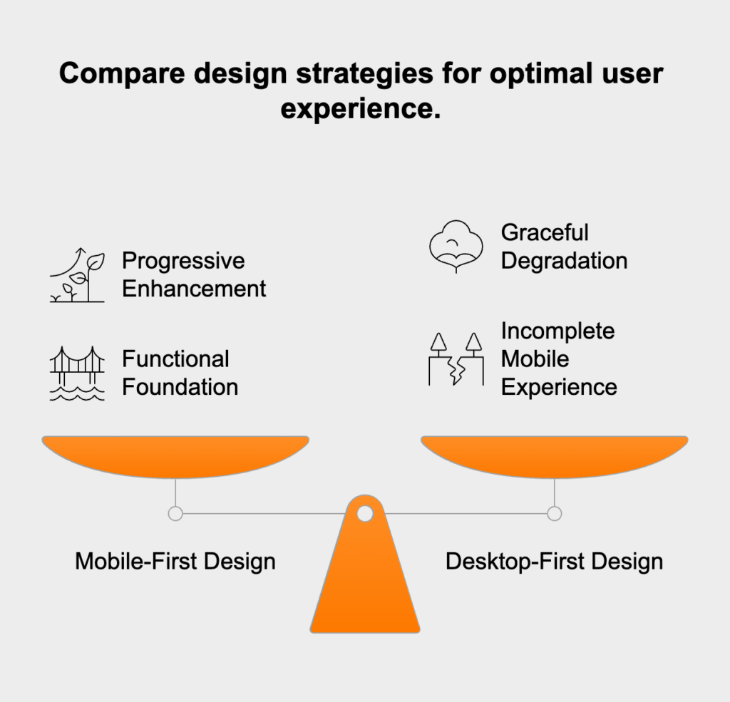
While people often use the terms interchangeably, mobile-first and responsive design aren’t the same thing. Responsive design is the technical result—a layout that adjusts to different screen sizes. Mobile-first, on the other hand, is the underlying strategy that guides how that adaptation happens. A website can be responsive without being mobile-first, but a true mobile-first site is always responsive. The main difference is the starting point and the thinking behind how you get to the final, flexible result.
Progressive enhancement is the idea that powers the mobile-first approach. It starts by building a core experience with essential content that works for everyone, even on older devices or slow networks. From that solid baseline, developers progressively add more advanced features and richer visuals as the screen size and device power increase. For instance, a simple list on a phone might become a detailed card layout with hover effects on a desktop. This method guarantees a functional and accessible foundation for all users, with extra features layered on as nice-to-haves, not necessities.
Graceful degradation is the reverse philosophy, typically tied to older, desktop-first workflows. With this method, you start with a full-blown desktop application and then try to strip away features or content to make it work on smaller screens. The biggest risk here is that the mobile experience often feels broken or incomplete—like a watered-down version of the “real” website. It can also cause major performance headaches on phones, since the site wasn’t originally built with lightweight assets and scripts in mind.
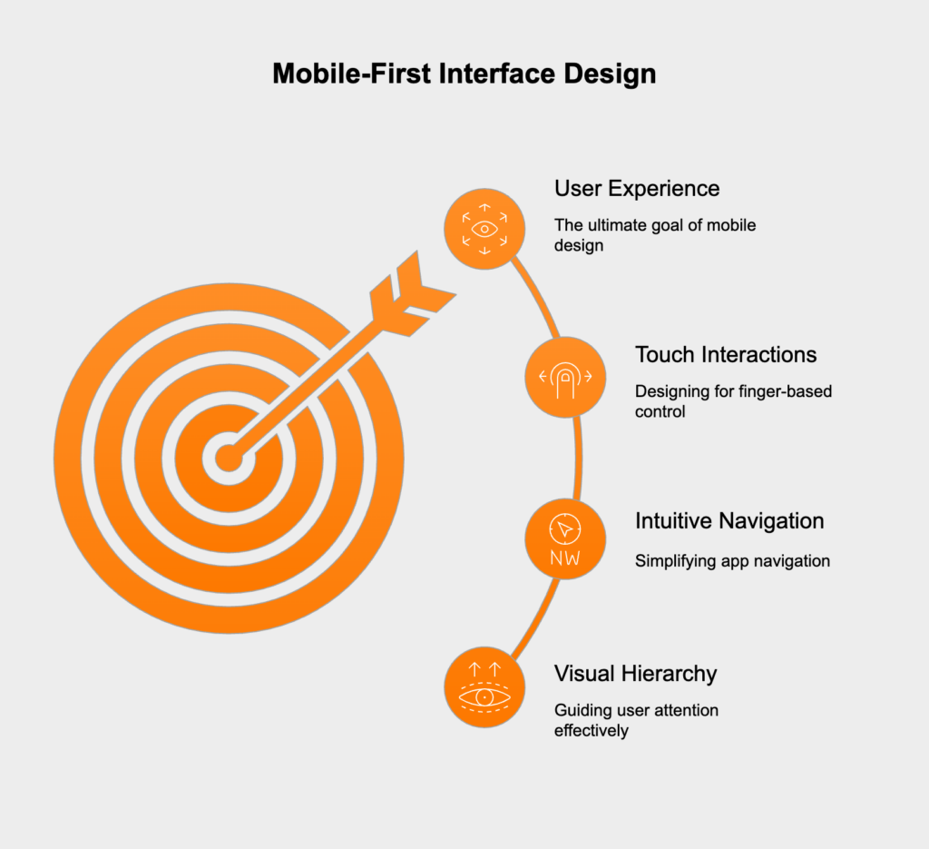
Effective mobile interfaces depend on smart design patterns that make them easy to use on small touchscreens. With such limited space, a strong visual hierarchy is everything. It’s all about arranging elements to show what’s most important, guiding the user’s attention directly to key information. This can be done by using bolder, larger fonts for headings, putting primary action buttons where they’re easily seen, and using whitespace to create separation between content. Prioritizing content this way helps users achieve their goals without getting lost in clutter.
Complex desktop menus just don’t work on mobile. Instead, mobile-first design uses navigation patterns that save space. The most common is the “hamburger” menu—the three-line icon that opens a navigation panel when tapped. Another effective pattern is the bottom tab bar, which keeps the main navigation options always visible and within easy reach of a thumb. The entire goal is to make getting around the app obvious and straightforward so users don’t get stuck.
Mobile interfaces are controlled with fingers, not a precise mouse pointer, so every interactive element has to be designed for touch. This means making buttons, links, and form fields large enough to tap easily, with enough space around them to prevent mistakes. A good rule of thumb is to make touch targets at least 44×44 pixels. It’s also vital to avoid relying on hover effects to show important information, since hovering isn’t possible on touch devices. Every function needs to be accessible with a simple tap or swipe.
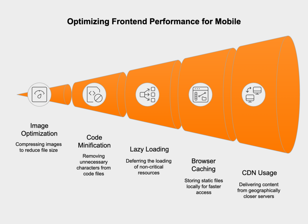
Performance is a huge part of a great mobile-first experience, especially since users might be on slower networks or less powerful devices. A major cause of slow load times is large files. Image optimization is essential; you should compress images to shrink their file size without ruining the quality and serve them in modern formats like WebP. Code files like CSS and JavaScript should also be minified to remove extra characters and bundled together to cut down on the number of requests the browser has to make to the server.
Lazy loading is a smart technique that puts off loading certain assets until they’re actually needed. It’s most often used for images or videos that are “below the fold,” meaning a user has to scroll to see them. By not loading these resources right away, the browser can display the visible part of the page much more quickly. This same idea can be applied to other non-essential resources, like JavaScript modules for specific components that only show up after a user interacts with the page.
<!-- Native lazy loading for an image --><img src="image.jpg" alt="A descriptive alt text." loading="lazy" width="200" height="200">Browser caching tells a user’s browser to save static files—like your logo, CSS, and JavaScript—on their device after their first visit. The next time they visit, the browser can load those files from its local storage instead of downloading them again, making the site load much faster. A Content Delivery Network (CDN) takes this even further by storing copies of your files on servers all over the world. When a user accesses your site, the CDN delivers the files from a server that’s geographically closest to them, which reduces network lag and speeds everything up.
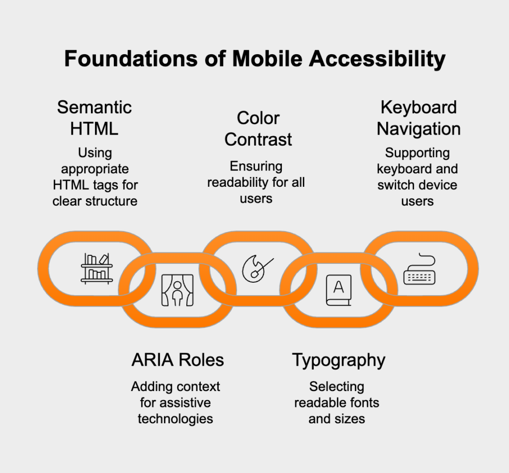
Accessibility (often shortened to A11y) is about making sure people with disabilities can use your website. Building accessibility into a mobile-first project from the very beginning is far more effective than trying to tack it on at the end. Plus, it usually creates a better, more reliable interface for everyone.
Semantic HTML means using the right HTML5 tags for the right job, like <nav> for navigation sections, <main> for the primary content, and <button> for actual buttons. This gives your page a clear structure that assistive tools, such as screen readers, can understand and communicate to users. When plain HTML isn’t enough, Accessible Rich Internet Applications (ARIA) attributes can add extra context, like signaling whether a menu is open or closed.
<!-- Example of semantic HTML and ARIA --><nav aria-label="Main navigation"> <ul> <li><a href="/">Home</a></li> <li><a href="/about">About</a></li> </ul></nav>Text needs to be readable for all users, including those with visual impairments. The Web Content Accessibility Guidelines (WCAG) state that the contrast between text and its background should be at least 4.5:1 for regular text. Fonts should be large enough to read on a small screen, and the layout shouldn’t break if a user needs to zoom in to make the text bigger.
Even though mobile interfaces are built for touch, they also need to work perfectly with a keyboard. This is critical for users with motor disabilities who might use keyboards or other switch devices to navigate. Every interactive element must be reachable with the Tab key, and whichever element is currently selected needs a clear visual indicator, like an outline. The tab order should also move logically through the page.
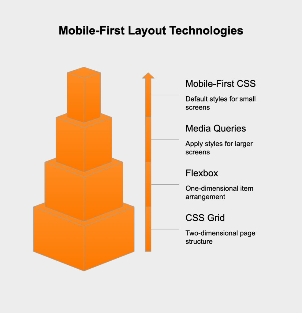
Bringing a mobile-first strategy to life depends on modern CSS features that create flexible, adaptive layouts. In a mobile-first workflow, the default CSS styles are written for small screens. Then, media queries using `min-width` are added to apply new or modified styles for larger screens. This approach is more efficient because mobile devices only download the basic CSS they need, which helps performance.
/* Default mobile styles */.container { width: 100%; padding: 1rem;}/* Styles for tablets and larger (progressive enhancement) */@media (min-width: 768px) { .container { max-width: 720px; margin: 0 auto; }}Flexbox and CSS Grid are two incredibly powerful layout tools that have changed the game for responsive design. Flexbox is perfect for arranging items in one dimension, like lining up elements in a header or spacing out buttons in a row. CSS Grid is designed for two-dimensional layouts, making it the ideal choice for managing the overall page structure, such as creating a main content area with a sidebar. You can even combine them to build sophisticated, fluid layouts that look great on any screen.
Rigorous testing is the final, crucial step to confirm that your mobile-first strategy was successful. It needs to cover everything from functionality and performance to usability across many different devices and network conditions. A good process mixes automated checks with manual testing. Browser developer tools have device simulators that are great for quick checks, but nothing beats testing on actual physical devices. This is the only way to catch real-world problems with touch interactions, hardware performance, and visual glitches. Watching actual users interact with the interface is also incredibly valuable for finding confusing spots and confirming that your design is as intuitive as you think it is.
Hicron’s contributions have been vital in making our product ready for commercialization. Their commitment to excellence, innovative solutions, and flexible approach were key factors in our successful collaboration.
I wholeheartedly recommend Hicron to any organization seeking a strategic long-term partnership, reliable and skilled partner for their technological needs.

After carefully evaluating suppliers, we decided to try a new approach and start working with a near-shore software house. Cooperation with Hicron Software House was something different, and it turned out to be a great success that brought added value to our company.
With HICRON’s creative ideas and fresh perspective, we reached a new level of our core platform and achieved our business goals.
Many thanks for what you did so far; we are looking forward to more in future!
Hicron is a partner who has provided excellent software development services. Their talented software engineers have a strong focus on collaboration and quality. They have helped us in achieving our goals across our cloud platforms at a good pace, without compromising on the quality of our services. Our partnership is professional and solution-focused!

The IT system supporting the work of retail outlets is the foundation of our business. The ability to optimize and adapt it to the needs of all entities in the PSA Group is of strategic importance and we consider it a step into the future. This project is a huge challenge: not only for us in terms of organization, but also for our partners – including Hicron – in terms of adapting the system to the needs and business models of PSA. Cooperation with Hicron consultants, taking into account their competences in the field of programming and processes specific to the automotive sector, gave us many reasons to be satisfied.
