July 14
10 min


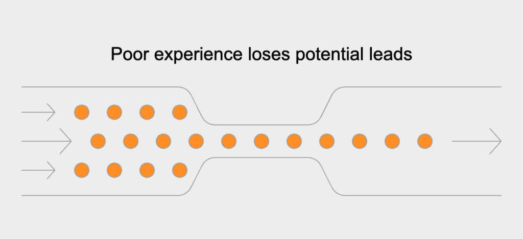
Today’s real estate world is mobile. It’s just that simple. With well over 75% of all property searches starting on a phone or tablet, a mobile-first website isn’t just a good idea—it’s essential. This strategy meets people where they are, giving potential buyers and sellers instant access they expect. If your site is built for a desktop, mobile users face a clumsy mess of pinching, zooming, and clunky menus. That frustration almost always leads to them leaving your site, which means a lost lead. A mobile-first design accepts reality: the first impression you make will be on a small screen, so the entire experience needs to be built for it.
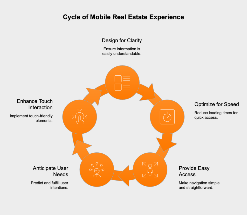
A great mobile experience for real estate feels intuitive and seamless on a small screen. It’s more than just a site that resizes; it actively anticipates what a user wants to do, like find listings, check out details, or call an agent. At its heart, a great mobile site gets rid of the usual frustrations. This means designing for clarity, speed, and easy access. The most important info—photos, price, and location—should be front and center, no endless scrolling required. Everything is built for touch, with big, tappable buttons and swipeable photo galleries that just feel right.
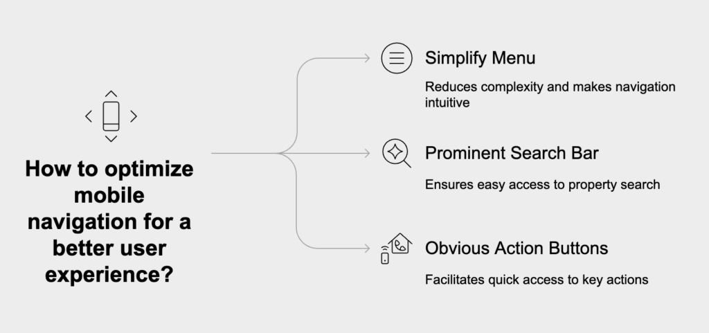
Clean, simple navigation is key to a good mobile experience because it makes it easy for buyers to find what they’re looking for. For a phone, that means a straightforward menu and a search bar you can’t miss. Important actions like searching for properties, contacting an agent, or saving a favorite need to be obvious buttons. When you reduce the number of taps it takes to get from your homepage to a property listing, you keep people focused on their search instead of getting frustrated. This simple change avoids the high bounce rates that come from trying to cram a confusing desktop menu onto a tiny screen.
Being accessible on the go is what keeps clients engaged. It lets people interact with your brand whenever they have a spare moment—on a lunch break, during their commute, or while talking things over with a partner. They can browse listings, save homes, or send a quick question right then and there. A mobile-first site makes this effortless, offering instant access to listings, contact forms, and agent info without any lag. This constant availability turns fleeting moments of interest into real leads and keeps you connected with clients throughout their search.
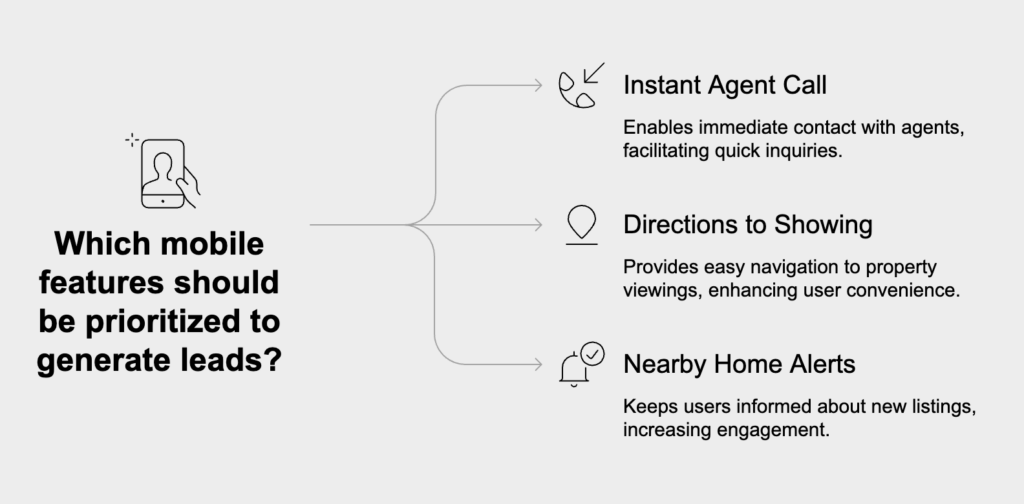
Certain mobile features are fantastic at turning casual browsers into actual leads because they use what a smartphone does best. They make it incredibly simple to go from seeing a property online to asking about it. When reaching out is easy, more people will do it. The best features are the ones that let users act instantly, like calling an agent, getting directions to a showing, or signing up for alerts about nearby homes. These tools are perfect for serious buyers who are actively searching and ready to make a move.
Built-in maps and GPS turn your website from a simple list of homes into a smart, location-based search tool. Using a phone’s GPS, your site can immediately show a user all the properties for sale right where they’re standing. This “near me” feature is a game-changer for buyers driving through new neighborhoods or looking for open houses. Plus, putting a map on every listing lets people see the home’s location, check out the street with street view, and figure out their commute, giving them the context they need to make a decision.
Yes, absolutely. A ‘click-to-call’ button is one of the best ways to get leads from your mobile site because it puts a potential client in touch with an agent in a single tap. This simple feature gets rid of the hassle of copying a number and switching apps to dial it—a small step that stops a surprising number of people. By making phone numbers tappable on every listing and agent profile, you make it dead simple for a motivated buyer to call the second they have a question. That immediate connection speeds everything up and brings in a lot more phone calls.
Virtual tours and photo galleries that work well on a phone are incredibly effective. They let potential buyers get a real feel for a property from wherever they are. On a mobile-friendly site, these tours and galleries load fast and are easy to use—you just swipe through photos or pan around a room. This gives people a great way to judge a home’s layout and condition before ever stepping inside. When the visuals are smooth and engaging, it keeps people looking at a listing longer, which gets them more invested and more likely to ask for a showing.
How your site performs on a phone directly affects your business. It’s not just a tech issue; performance is a huge part of the user’s experience and it shapes everything from lead generation to how people see your brand. A slow, clunky mobile site will literally push potential clients to your competitors. On the other hand, a fast, responsive site builds trust and gets people to take action. Every second a user waits for a page to load makes it more likely they’ll just give up, which hits your bottom line hard.
It’s a simple trade-off: the longer a page takes to load, the faster people will leave your site. Mobile users expect things to be instant. If a page of property listings takes more than a couple of seconds to show up, a huge chunk of your visitors will be gone before they even see it. A low bounce rate is a great sign that people find your site useful and are sticking around. To get the speed you need to keep users engaged, you have to optimize your images, clean up your code, and use up-to-date web tech.
Google gives a big boost in search rankings to sites that work well on mobile. This is because of its mobile-first indexing policy, which means Google mainly looks at the mobile version of your site to decide how to rank it. If your site provides a bad mobile experience, you’ll get pushed down in search results, even when people are searching from a desktop. But if your real estate site is fast, easy to use on a phone, and gives people what they need, Google’s algorithm will reward you. The result is better visibility and more organic traffic, which means a steady flow of new leads for your business.
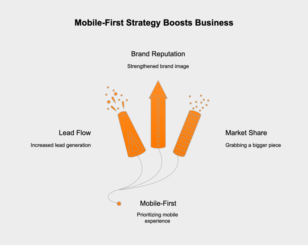
Going mobile-first has a real, measurable effect on your business that goes way beyond just making users happy. It directly impacts your lead flow, brand reputation, and how you stack up against the competition. When your online presence matches how people actually behave today, you can grab a bigger piece of the market and work more efficiently. Putting money into a great mobile site pays off with better conversion rates and a stronger brand that connects with modern clients. It’s not about chasing trends; it’s about setting your business up for long-term growth.
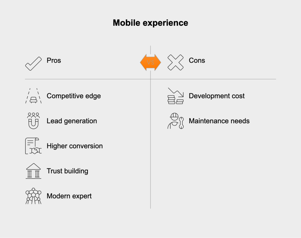
A mobile-first website helps you reach a much wider audience simply by making your listings easy to access for everyone. This includes younger, first-time buyers who’ve grown up with phones, and busy professionals who use their devices for everything. When you provide a great experience on any screen, you can connect with people who might ignore traditional marketing. In a competitive field, this wider reach is critical because it opens the door to new groups of potential clients and makes sure your brand shows up no matter how or where people are looking for homes.
Without a doubt. In a crowded market, a great mobile experience is a huge competitive advantage. Think about it: when a potential client checks out a few agent websites on their phone, which one will they choose? The one that’s fast, simple, and actually helpful. A smooth mobile site shows you’re professional and focused on what your clients need, which builds trust and sets you apart. While your competitors are stuck with slow, clunky sites, you’ll be the one who captures more leads, closes them more often, and becomes known as the modern, go-to expert in your area.
Hicron’s contributions have been vital in making our product ready for commercialization. Their commitment to excellence, innovative solutions, and flexible approach were key factors in our successful collaboration.
I wholeheartedly recommend Hicron to any organization seeking a strategic long-term partnership, reliable and skilled partner for their technological needs.

After carefully evaluating suppliers, we decided to try a new approach and start working with a near-shore software house. Cooperation with Hicron Software House was something different, and it turned out to be a great success that brought added value to our company.
With HICRON’s creative ideas and fresh perspective, we reached a new level of our core platform and achieved our business goals.
Many thanks for what you did so far; we are looking forward to more in future!
Hicron is a partner who has provided excellent software development services. Their talented software engineers have a strong focus on collaboration and quality. They have helped us in achieving our goals across our cloud platforms at a good pace, without compromising on the quality of our services. Our partnership is professional and solution-focused!

The IT system supporting the work of retail outlets is the foundation of our business. The ability to optimize and adapt it to the needs of all entities in the PSA Group is of strategic importance and we consider it a step into the future. This project is a huge challenge: not only for us in terms of organization, but also for our partners – including Hicron – in terms of adapting the system to the needs and business models of PSA. Cooperation with Hicron consultants, taking into account their competences in the field of programming and processes specific to the automotive sector, gave us many reasons to be satisfied.
