June 18
8 min


Real optimization starts with data, not code. Without a clear measurement strategy, any attempt to improve performance is just guesswork. You need to establish a quantitative baseline that reflects what your users actually experience. This means tracking a mix of lab-simulated metrics and, more importantly, field data from real user sessions. Knowing what to measure and which tools to use is how you find bottlenecks, prove your fixes worked, and stop performance from degrading over time.
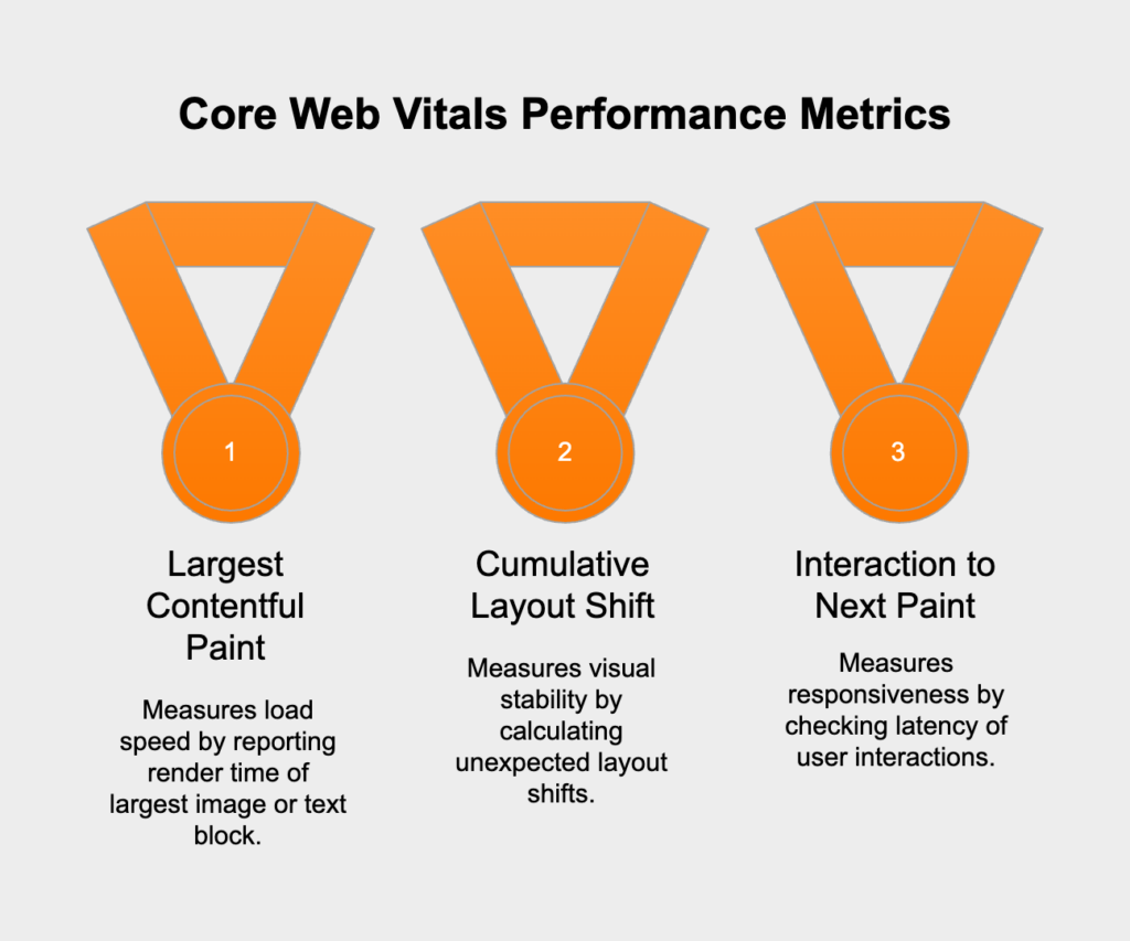
The current standard for measuring user-focused performance is Google’s Core Web Vitals. These metrics are designed to gauge the quality of a user’s experience on a page, and they’re important for both UX and SEO. The main vitals are:
Beyond these, a solid audit should also track Time to First Byte (TTFB) to check server responsiveness and the Speed Index to see how quickly content appears on screen. Put together, these numbers give you a detailed picture of both how fast your app feels and how it’s performing technically.
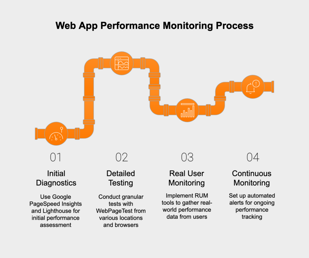
You’ll need a few key tools to gather and analyze performance data. For initial diagnostics and clear recommendations, Google PageSpeed Insights and Lighthouse are your go-to options. They simulate a page load in a controlled lab environment to give you a performance score and a checklist of improvements. For a deeper dive, WebPageTest lets you run granular tests from different locations, browsers, and network speeds.
While lab data is a great start, Real User Monitoring (RUM) is essential for understanding how your app performs for people in the wild. RUM tools collect data straight from your users’ browsers, revealing real-world bottlenecks that lab tests can’t catch. The final step is setting up continuous monitoring with automated alerts. This allows your team to spot performance regressions or outages right after a new deployment or infrastructure change.
The front-end is where users feel performance—or the lack of it. It doesn’t matter how fast your back-end is if the interface is slow and clunky. Optimizing the front-end means sending less data, loading it smartly, and building an interface that works smoothly on any device. Every kilobyte you trim and every millisecond you shave off the render time makes a direct impact on user satisfaction.
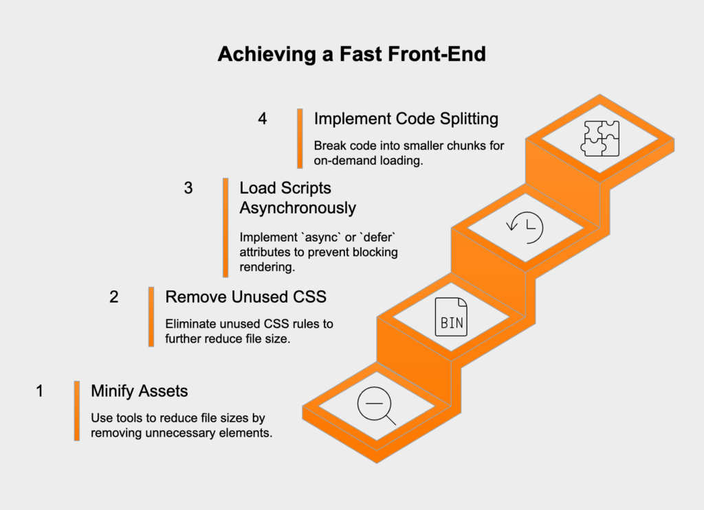
A fast front-end is built on clean, efficient code. The first step is to shrink your assets. Tools like UglifyJS for JavaScript and CSSNano for CSS can minify your files by stripping out whitespace, comments, and long variable names. On top of that, a tool like PurgeCSS can scan your project and remove unused CSS rules entirely—a huge win if you’re using a big framework like Bootstrap or Tailwind CSS.
How you load your code is just as important. By default, JavaScript blocks rendering. You can get around this by adding the `async` or `defer` attributes to your script tags. For bigger apps, code splitting is a game-changer. This practice breaks your code into smaller chunks that only load when a user needs a specific feature or visits a certain route, which drastically cuts down initial page load times.
Images are usually the heaviest assets in a web app, so optimizing them is non-negotiable. Always compress your images and serve them in modern formats like WebP or AVIF when possible. Use responsive image techniques, like the `srcset` attribute or the `
Cutting down on HTTP requests is another important goal. Even with HTTP/2 handling multiple requests better, reducing dependencies and bundling files where it makes sense still helps. To speed up delivery for a global audience, serve all your static assets (CSS, JavaScript, images) from a Content Delivery Network (CDN). A CDN copies your files to servers around the world, so users download them from a location nearby, which dramatically cuts latency. Finally, set up browser caching so that repeat visitors can load static files from their local machine instead of downloading them all over again.
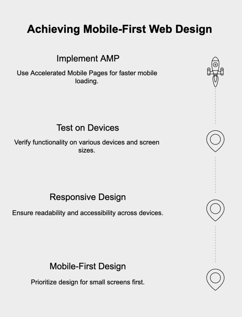
Since most web traffic now comes from mobile devices, a mobile-first design philosophy is no longer optional. This means you design for the smallest screen first and then add enhancements for larger ones. This approach creates a better mobile experience. It also encourages a more disciplined, performance-minded development process right from the start.
A responsive and accessible design depends on readable font sizes (start with a 16px base) and proper line spacing. To make sure everything works correctly, you have to test on a wide range of devices and screen sizes. Use a service like BrowserStack to test on real hardware and Google’s Mobile-Friendly Test for quick checks. For sites with a lot of content, look into Accelerated Mobile Pages (AMP) to serve a stripped-down, incredibly fast version of your pages to mobile visitors.
The foundation of a fast web app is a quick and efficient back-end. Your server and database are the engine, handling business logic and sending data to the client. A slow server or sluggish database query will create bottlenecks that even a perfectly tuned front-end can’t hide. Fine-tuning the back-end means optimizing every part of the process, from the database query to the final response packet.
The link between your app and its database is a frequent source of slowdowns. Inefficient queries can bring an application to its knees, especially under heavy traffic. The first job is to find and fix slow queries by making sure you have proper indexes on all relevant table columns. Another major issue to hunt down is the N+1 query problem, where the app makes one query for a list of items and then N more queries to get related data for each one. These need to be refactored into a single, efficient join. Fixing these issues will directly lower your TTFB, which is a clear sign of a healthier server.
When your app has to show a large amount of data, fetching it all at once is a terrible idea. It hammers the server, wastes bandwidth, and can crash the client’s browser. The right way to handle this is with server-side pagination or infinite scrolling. Here, the server sends only a small, manageable chunk of data for the first view. As the user clicks to the next page or scrolls down, the client requests the next chunk. This “just-in-time” data loading approach radically cuts the initial load on both the server and the browser, making for a much faster and smoother experience.
With the fundamentals covered, you can use advanced automation and user-focused analysis to gain a real edge. These strategies go beyond basic asset and code tweaks, moving into proactive and intelligent performance management. By using AI and studying user behavior, you can fix problems before they happen and refine the user experience with a level of detail that goes beyond standard metrics.
AI is changing how we approach web performance. AI-driven services like NitroPack can automate tricky tasks like image compression, code minification, and CDN management on the fly, constantly adjusting settings to get the best results with no manual work. Beyond simple optimization, AI can also power predictive monitoring. These systems watch performance trends and can warn you about potential slowdowns before they affect users. Another smart use of AI is for navigation, where the system predicts a user’s next move and prefetches the needed assets, making the next page load feel instant.
At the end of the day, web performance is all about delivering a better user experience. While metrics like LCP and INP give you great technical data, they don’t show the full picture. User behavior analytics tools like Hotjar or Google Analytics let you see how people actually use your application. By watching session recordings, analyzing heatmaps, and tracing user journeys, you can spot friction points that raw metrics would never show you. You might see rage clicks on a slow component, find a confusing navigation path that makes users pause, or discover broken elements that are causing frustration. Fixing these issues is one of the most direct ways to improve both perceived performance and overall UX.
Hicron’s contributions have been vital in making our product ready for commercialization. Their commitment to excellence, innovative solutions, and flexible approach were key factors in our successful collaboration.
I wholeheartedly recommend Hicron to any organization seeking a strategic long-term partnership, reliable and skilled partner for their technological needs.

After carefully evaluating suppliers, we decided to try a new approach and start working with a near-shore software house. Cooperation with Hicron Software House was something different, and it turned out to be a great success that brought added value to our company.
With HICRON’s creative ideas and fresh perspective, we reached a new level of our core platform and achieved our business goals.
Many thanks for what you did so far; we are looking forward to more in future!
Hicron is a partner who has provided excellent software development services. Their talented software engineers have a strong focus on collaboration and quality. They have helped us in achieving our goals across our cloud platforms at a good pace, without compromising on the quality of our services. Our partnership is professional and solution-focused!

The IT system supporting the work of retail outlets is the foundation of our business. The ability to optimize and adapt it to the needs of all entities in the PSA Group is of strategic importance and we consider it a step into the future. This project is a huge challenge: not only for us in terms of organization, but also for our partners – including Hicron – in terms of adapting the system to the needs and business models of PSA. Cooperation with Hicron consultants, taking into account their competences in the field of programming and processes specific to the automotive sector, gave us many reasons to be satisfied.
