Blog

How do You Implement Web Accessibility that Follows WCAG Rules?

Monika Stando
Monika Stando
Marketing & Growth Lead
July 08
9 min
Table of Contents

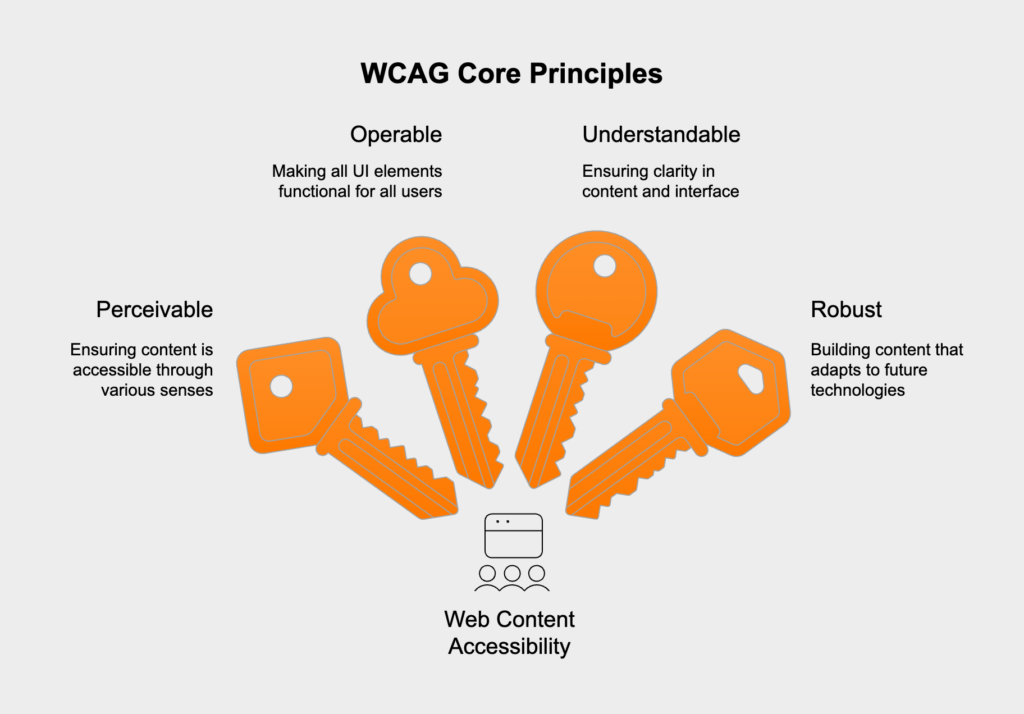
The Web Content Accessibility Guidelines (WCAG) rest on four core principles, easily remembered by the acronym POUR. Think of them as the high-level goals that steer developers toward creating web content that works for everyone, especially people with disabilities. While the full WCAG gets into specific, testable criteria, everything ladders up to these four pillars.

  • perceivable, meaning information and UI elements have to be presented in a way users can actually perceive, this involves making sure people can use their available senses—like sight, sound, or touch—to take in the content, which is key for users who are blind, have low vision, or are deaf,
  • operable, where all UI components and navigation must actually work for the user, this means someone has to be able to use every control, button, and interactive element, preventing situations where an interaction is impossible for a person with a motor disability,
  • understandable, which dictates that both the information itself and how the interface works should be clear, users need to be able to grasp the content and figure out the UI without getting lost or confused, a principle that’s especially helpful for those with cognitive or learning disabilities,
  • robust, ensuring content is built well enough to be interpreted reliably by a huge range of user agents, including the assistive technologies of today and tomorrow, essentially, as tech changes, the content must keep working.

These principles are designed to be technology-agnostic. They’re backed by specific, testable success criteria that fall into three levels of conformance: A (the baseline), AA (the industry standard), and AAA (the highest level). For most organizations trying to meet legal requirements and follow best practices, hitting WCAG 2.1 Level AA is the goal.

How do you translate WCAG principles into practical code?

So, how do you turn the POUR principles into actual code? It boils down to a few key development practices. When developers prioritize semantic markup, smart interaction design, and clear presentation, they build interfaces that are accessible from the ground up.

Ensuring content is perceivable for all users

Making content perceivable means offering text alternatives for anything that isn’t text and guaranteeing a clean, clear visual layout. This is what allows screen readers to describe content and helps users with low vision see it properly.

  • provide `alt` text for images, since every meaningful image needs descriptive alt text, while purely decorative images should get an empty alt attribute (`alt=””`) so screen readers know to skip them,
  • offer captions and transcripts, because all pre-recorded videos with sound must have synchronized captions, and any audio-only content needs a full transcript,
  • maintain color contrast, as text needs a contrast ratio of at least 4.5:1 against its background (or 3:1 for large text), this is a huge one that many sites get wrong,
  • support text resizing, so users can scale text up to 200% without the page breaking or losing functionality, which is why you should use relative units like `rem` or `em` for fonts, not pixels.
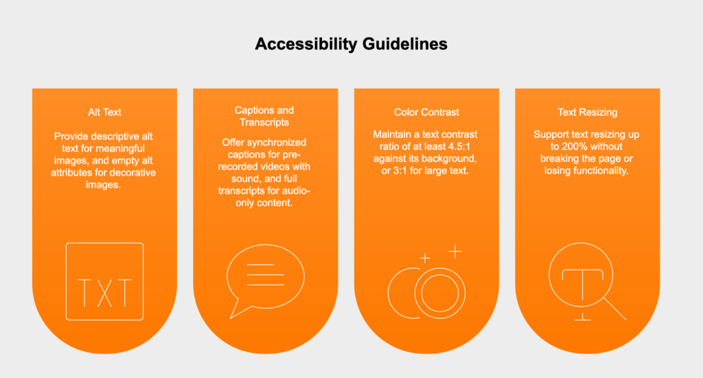
<!-- Good Example: Informative alt text --><img src="chart.png" alt="Bar chart showing a 20% increase in user engagement in Q4."><!-- Good Example: Decorative image is ignored by screen readers --><img src="decorative-border.png" alt="">

Making user interface components fully operable

Operability is all about making sure people can actually use every part of your interface, whether they’re using a mouse, a keyboard, or another kind of assistive device.

  • implement full keyboard accessibility, so every interactive element—links, buttons, forms, you name it—can be reached and used with the Tab key and other standard keyboard commands,
  • guarantee a visible focus indicator, because when someone tabs to an element, it needs a clear outline or style to show where they are, whatever you do, don’t use `outline: none;` unless you’ve created an equally obvious replacement,
  • avoid keyboard traps, where the keyboard focus gets stuck inside a component like a pop-up modal, a user must always be able to tab into *and* out of every part of the interface.

Creating understandable content and navigation

An interface is understandable if its content is easy to read, it behaves predictably, and it guides users to fix mistakes. While this is vital for users with cognitive disabilities, it makes the experience better for absolutely everyone.

  • use descriptive page titles, as the `<title>` tag for every page needs to clearly state what that page is about,
  • label forms and provide clear error messages, since every input field needs a properly connected `<label>`, and if an error happens, the message must explain what went wrong and how to correct it,
  • maintain consistent navigation, which means menus and other recurring links or buttons should always be in the same place and work the same way on every page.
<!-- Good Example: Programmatically linked label and input --><label for="user-email">Email Address:</label><input type="email" id="user-email" name="email">

Building robust applications for future compatibility

Robustness really comes down to writing clean, standards-compliant code. This ensures your site works reliably with today’s browsers and assistive tech, as well as whatever comes next. Using HTML correctly is the foundation of it all.

  • use semantic HTML, meaning you should always use native HTML elements for what they were made for (`<nav>`, `<main>`, `<button>`, etc.), this gives you a ton of accessibility features like keyboard controls and proper roles for free,
  • apply ARIA when necessary, by using Accessible Rich Internet Applications (ARIA) attributes to fill in the gaps for custom components where plain HTML won’t cut it, for instance, you can add `role=”button”` to a `<div>` that looks like a button, but just using a real `<button>` is always the better choice,
  • ensure correct name, role, and value, so for any custom component, assistive tech can figure out its name (the label), its role (what it is), and its current value or state (like “checked”).
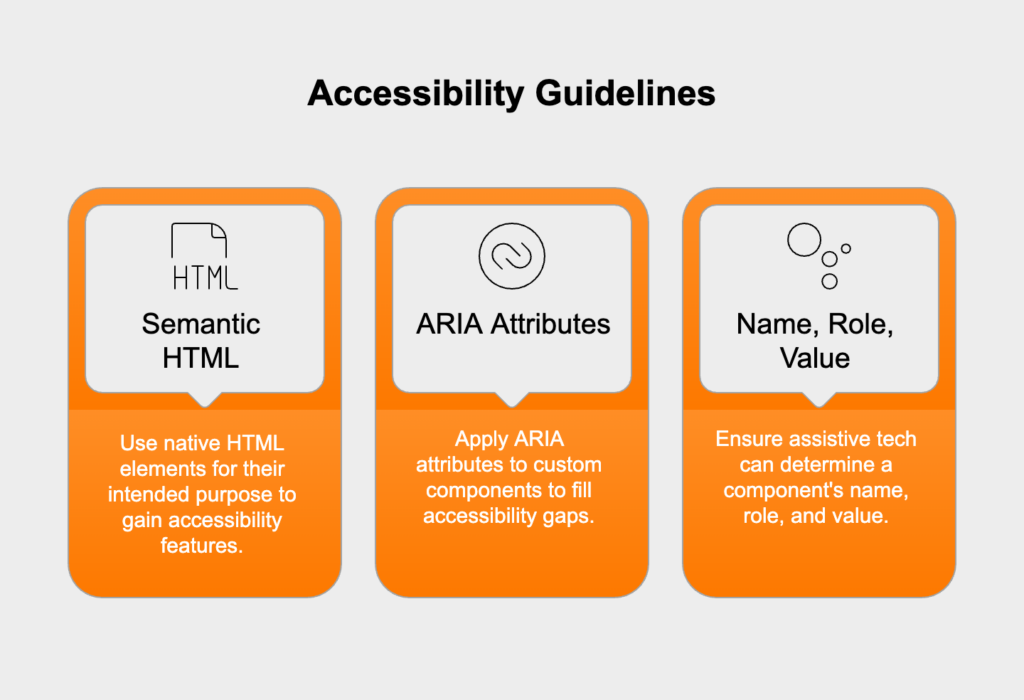
<!-- Best Practice: Use a native HTML element --><button>Submit</button><!-- Acceptable Fallback: Use ARIA to add semantics to a non-semantic element --><div role="button" tabindex="0">Submit</div>

What does a comprehensive accessibility testing strategy involve?

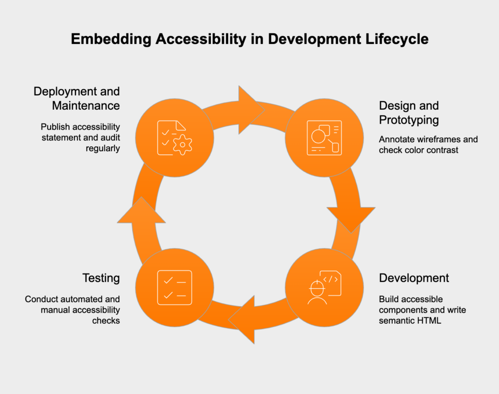
You can’t rely on just one method for accessibility testing; it’s simply not enough. A solid strategy needs to combine automated tools, hands-on manual checks, and direct feedback from users. This layered approach is the only way to catch all the barriers and ensure your site is both technically compliant and actually usable.

Leveraging automated testing tools effectively

Automated tools like Axe, WAVE, and Google Lighthouse are fantastic for a quick first pass. They can scan a page and instantly flag common, black-and-white WCAG violations, making them perfect for catching the low-hanging fruit.

  • strengths, as they’re great at finding things like missing `alt` text, bad color contrast, unlabeled form fields, and improper ARIA use,
  • limitations, because automation can only catch about 25-30% of all accessibility problems, it can’t tell you if your `alt` text actually makes sense, if the tab order is logical, or if a complex widget is truly usable, so while you should build them into your CI/CD pipeline for ongoing checks, they can never be your only testing method.

Performing essential manual testing procedures

Manual testing is absolutely non-negotiable for finding the issues that automated tools miss. It requires developers and QA testers to step into the shoes of users with disabilities and experience the site as they would.

  1. keyboard-only navigation test, where you unplug your mouse and try to use the entire site, ask yourself: can I get to everything? Is the tab order logical? Can I always see where my focus is? Can I use every widget and get out of it again?,
  2. screen reader test, by firing up a tool like NVDA, VoiceOver, or JAWS to browse the page, listen to what it says, does it make sense? Are images and buttons described well? Is the reading flow logical?,
  3. content zoom and reflow test, by cranking your browser zoom up to 200%, does the layout adjust to a single column without forcing you to scroll sideways? Is all the text still readable, with nothing overlapping?.

Why is direct user testing with people with disabilities irreplaceable?

Even with automated and manual checks, you’re only verifying technical compliance, not genuine usability. User testing with people with disabilities is the only way to know for sure if your site is actually accessible in the real world. These users will find roadblocks you never would have thought of—confusing navigation, unclear link text, or features that are technically compliant but functionally unusable. Their feedback is pure gold, helping you move past a simple checklist to build something that’s genuinely inclusive.

How can you embed accessibility into the development lifecycle?

Leaving accessibility to the end is a recipe for expensive, frustrating rework. The best strategy is to “shift left,” which just means building accessibility into every single stage of the development process from the very beginning.

  • design and prototyping, by annotating wireframes with accessibility notes like heading structure, tab order, and focus indicators, you should also check your color palette for proper contrast before a single line of code is written,
  • development, where you can build a library of accessible, reusable components, write semantic HTML from day one, and make accessibility a required part of every code review,
  • testing, which means adding automated scans to your CI pipeline to catch problems early, and making manual keyboard and screen reader checks a standard QA step,
  • deployment and maintenance, by publishing an accessibility statement that shows your commitment and gives users a way to report issues, you should also schedule regular, full accessibility audits to stay on track.

What are the key legal considerations for WCAG compliance?

It’s important to know that WCAG itself isn’t a law—it’s a set of guidelines. However, it has become the de facto global standard for digital accessibility. Following WCAG is the main way organizations can meet their legal duties and reduce the risk of lawsuits.

In the U.S., for example, courts consistently point to WCAG as the standard for complying with laws like the Americans with Disabilities Act (ADA) and Section 508. It’s a similar story in the European Union, Canada, and other nations where laws directly mandate WCAG conformance.

The widely accepted target for staying on the right side of the law is WCAG 2.1 Level AA. If you don’t meet this standard, your organization could face serious legal trouble, from demand letters and lawsuits to expensive settlements. Making sure you document your accessibility work, run regular audits, and publish an accessibility statement are all key steps to show you’re making a good-faith effort.

Monika Stando
Monika Stando
Marketing & Growth Lead
  • follow the expert:

Testimonials

What our partners say about us

Hicron’s contributions have been vital in making our product ready for commercialization. Their commitment to excellence, innovative solutions, and flexible approach were key factors in our successful collaboration.
I wholeheartedly recommend Hicron to any organization seeking a strategic long-term partnership, reliable and skilled partner for their technological needs.

tantum sana logo transparent
Günther Kalka
Managing Director, tantum sana GmbH

After carefully evaluating suppliers, we decided to try a new approach and start working with a near-shore software house. Cooperation with Hicron Software House was something different, and it turned out to be a great success that brought added value to our company.

With HICRON’s creative ideas and fresh perspective, we reached a new level of our core platform and achieved our business goals.

Many thanks for what you did so far; we are looking forward to more in future!

hdi logo
Jan-Henrik Schulze
Head of Industrial Lines Development at HDI Group

Hicron is a partner who has provided excellent software development services. Their talented software engineers have a strong focus on collaboration and quality. They have helped us in achieving our goals across our cloud platforms at a good pace, without compromising on the quality of our services. Our partnership is professional and solution-focused!

NBS logo
Phil Scott
Director of Software Delivery at NBS

The IT system supporting the work of retail outlets is the foundation of our business. The ability to optimize and adapt it to the needs of all entities in the PSA Group is of strategic importance and we consider it a step into the future. This project is a huge challenge: not only for us in terms of organization, but also for our partners – including Hicron – in terms of adapting the system to the needs and business models of PSA. Cooperation with Hicron consultants, taking into account their competences in the field of programming and processes specific to the automotive sector, gave us many reasons to be satisfied.


PSA Group - Wikipedia
Peter Windhöfel
IT Director At PSA Group Germany

Get in touch

Say Hi!cron

    Message sent, thank you!
    We will reply as quickly as possible.

    By submitting this form I agree with   Privacy Policy

    This site uses cookies. By continuing to use this website, you agree to our Privacy Policy.

    OK, I agree