Automotive Spare Parts Management: A Critical Aspect of After-Sales Processes
- February 14
- 18 min

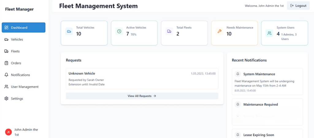
Fleet management dashboard design is the process of creating a visual interface that translates complex vehicle and operational data into a clear, actionable format. A well-designed dashboard gathers information from telematics, fuel cards, and maintenance logs, presenting it in a way that helps managers monitor performance and make informed decisions without delay.
This article covers the core principles of effective fleet management dashboard design. We will explore the benefits of a well-planned interface, key features every dashboard should have, and best practices for creating a user-friendly experience on both desktop and mobile. We will also look at how designing for specific user roles and leveraging customization can unlock a dashboard’s full potential.
Key Takeaways:
A tailored fleet management dashboard is more than just a data display; it is the command center for your entire fleet operation. An effective design helps your team shift from reactive problem-solving to proactive management, leading to better efficiency, reduced costs, and improved safety.
One of the primary benefits is enhanced decision-making. Instead of searching through different reports and spreadsheets, managers get a unified view of key performance indicators (KPIs). This makes it easy to analyze fuel consumption, driver idle time, and maintenance schedules, enabling quick, data-supported actions.
It also creates complete operational visibility. You can
This level of insight helps identify potential issues, like a vehicle that needs repair or a driver taking an inefficient route, before they turn into costly disruptions.
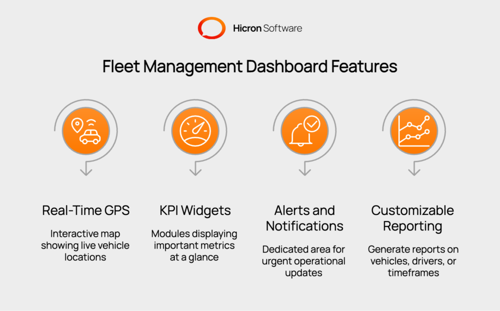
To be truly useful, a fleet management dashboard must include specific features that offer a comprehensive overview of your operations. These elements work together to provide clarity and control.

Mobile-first design principles ensure the dashboard remains fully functional across all devices, with touch-friendly interfaces and consistent functionality that allows field managers and drivers to access real-time tracking, alerts, and reports from smartphones and tablets with the same ease as desktop users.
User-based personalization through role-specific dashboards tailors the interface to meet the unique needs of fleet managers, dispatchers, maintenance staff, and drivers, while customizable modules allow each user to prioritize the most relevant data for their daily tasks.
The overall user experience (UX) relies on intuitive navigation, consistent design elements, accessibility standards with proper color contrast and scalable fonts, mobile-optimized visuals, and integrated user feedback tools that enable continuous improvement based on input from both field and office personnel.
The value of a dashboard is determined by its usability. A cluttered or confusing interface will go unused, no matter how powerful the data behind it. Following user experience (UX) and user interface (UI) best practices ensures the tool is both functional and easy to navigate.
UX focuses on making the dashboard intuitive and efficient for the user. A primary goal is to create a logical information hierarchy. The most critical data, such as active alerts or underperforming KPIs, should be immediately visible without requiring clicks or scrolling.
The user journey should be logical, allowing managers to move from a high-level overview to granular details effortlessly. Personalization is also a key UX element; users should be able to customize their dashboard view to prioritize the metrics most relevant to their role.
UI is concerned with the visual presentation of the dashboard. Clarity is the top priority. The layout should be clean and organized, using a grid system to align elements and create a sense of order. Data visualizations like
are essential for making complex information easy to digest. For instance, using red for alerts and green for positive performance provides instant context. Consistency in colors, fonts, and icon styles across the platform builds familiarity, while ensuring the design is mobile-responsive guarantees access for managers on the go.

Fleet managers are often away from their desks. A responsive dashboard that works flawlessly on desktops, tablets, and smartphones is a necessity. Mobile design should prioritize simplicity. The most critical information, like the map and urgent alerts, should be easily accessible.
Use large, touch-friendly buttons and ensure that data visualizations are readable on smaller screens. The mobile experience should be streamlined, focusing on the core tasks a manager needs to perform while on the go.
Different roles within an organization require different information. A great fleet management dashboard design accounts for this by allowing for personalization and role-based access.
By tailoring the dashboard to each user’s responsibilities, you ensure the tool is relevant and helps them perform their job more effectively.
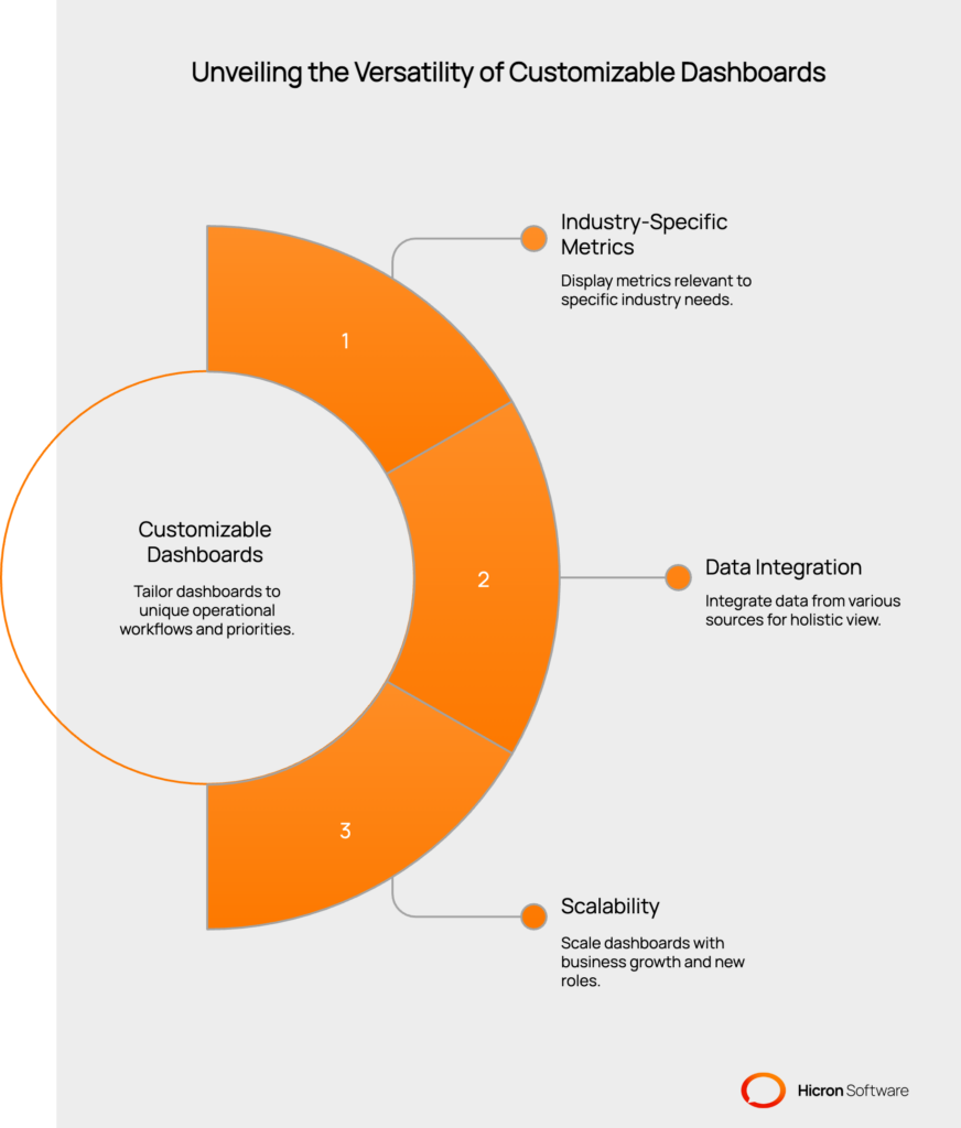
The next evolution of dashboard utility comes from fleet automation platforms with customizable dashboards. These systems move beyond one-size-fits-all solutions by allowing you to completely tailor the interface to your unique operational workflow.
This adaptability is important because every industry has different priorities. A construction company may focus on asset location and engine hours, while a delivery service will concentrate on on-time performance and route efficiency. A customizable fleet management dashboard lets each business display the metrics that matter most to its success.
Automated fleet management platforms can integrate data from other sources, such as
This creates a single, holistic view of your entire operation, removing information silos between departments. As your business grows, a customizable dashboard can scale with you, allowing you to add new KPIs and create different views for new roles.

An effective fleet management dashboard design is foundational to modern fleet operations. By centralizing data, highlighting key metrics, and providing real-time visibility, a well-built dashboard acts as a command center for improving efficiency and reducing costs.
When choosing a solution, focus on platforms that offer essential features like real-time tracking, robust reporting, and a great mobile experience. Most importantly, consider fleet automation platforms with customizable dashboards. The ability to tailor the interface to your specific industry, user roles, and business needs is what transforms a good dashboard into an indispensable asset for your entire organization. Get in touch to learn more.
While many features are valuable, the real-time GPS tracking map is often the most critical. It provides immediate visibility into your fleet’s location and status, which is the basis for most other operational decisions.
A dashboard helps reduce fuel costs by monitoring KPIs like fuel efficiency, idle time, and driver behaviors like speeding. By identifying inefficient vehicles or driving patterns, you can take corrective action, such as scheduling maintenance or providing driver training.
Yes, leading fleet automation platforms allow for role-based access and customizable views. This means a dispatcher, a fleet manager, and an executive can all have different dashboard layouts tailored to the information they need most.
Modern fleet management platforms use APIs (Application Programming Interfaces) to connect with other software, such as accounting systems or ERPs. This allows the dashboard to display financial data or customer information, providing a more complete view of operations.
Absolutely. Any modern fleet management dashboard should have a mobile-responsive design, allowing you to access all its features and data from a smartphone or tablet. This is essential for managers who need to monitor operations from anywhere.
